Colour Me Good
Colour is an emotive subject. It can affect the way we feel. And vice versa: our moods can affect what colours we choose to put on in the morning.
Colour is even used to describe our moods: are you in a black mood? Feeling blue? Or is everything rosy?
It stands to reason, then, that colour is an important part of visual communication.
Colourful Communications
Some researchers have suggested that, depending on the product, between 62% and 90% of consumers made snap judgements about products based on its colour alone.
This makes it essential for any marketer or social media practitioner to understand colour and the ways in which we can use it to reinforce our communications. This is true both online or offline, but it is particularly true online – where other ‘real world’ clues about the brand, product or message might be missing.
What Does Each Colour Mean?
The internet abounds with explanations about which colour can help you create which mood.
Red is a visually intense colour with high visibility so it is good for warning signs. It symbolises strength, blood, powerful emotions, sex and love.
Orange is a bright, cheerful colour. It symbolises warmth, energy, excitement, happiness and the tropics.
Green is usually linked to nature and natural products. Dark green can signify wealth or status.
Blue is a calming colour which symbolises loyalty and strength. That’s why so many corporations feature blue in their logos.
Purple has long been associated with royalty or the nobility. It symbolises power, luxury, mystery and magic.
White is usually associated with purity, goodness, cleanliness and virginity.
Mixed Messages
For some colours, deciphering their cultural messaging is a little more complex.
Brown is an earthy colour. It can be perceived as drab, but equally may bring to mind hard work or stability.
Black is often used to express negative feelings, and is the colour of mourning (for us, at least, but more on this later). But black can also be perceived as classic and sophisticated too. And it can certainly make a powerful visual statement.
Yellow is similarly powerful visually. It is usually perceived as bright and cheerful; stirring feelings of joy, happiness and optimism. Yet it is also associated with betrayal and cowardice.
Cultural Connotations
Once our messages start travelling outside Europe, the picture gets even more complicated.
In China, red is strongly associated with success, happiness, and good luck.
In India and the Middle East, white is the colour of mourning.
In South America green can be associated with death. Yet in Islam green is a very positive colour.
If we’re going to be running multi-national campaigns, we need to understand and consider these cross-cultural shifts in meaning.
A Time Apart
But it isn’t just cultural dissonance that can affect our understanding of colour.
Time plays a part too.
The colour system company, Pantone, highlights colour trends by announcing a ‘colour of the season’ every three months. The company charts how colours have changed over the decades in their articles.
Over time, these subtle shifts can create dramatic changes. For example, this Smithsonian magazine article describes how pink was once the favoured colour for dressing little boys ; blue was for girls.
Brand Messages
So, if so much of what a colour represents is open to interpretation, how do we square that with its importance in visual communication?
There are several aspects that we need to consider, of which matching the brand values with those values which the colour represents in the host culture is only (the first) one.

1. How appropriate is the colour to the personality of the brand? McDonalds’ red and yellow worked well to convey the sense of fun and excitement of a ‘fast food’ experience in a 1980’s market where stuffy waiter service was the norm, but its switch to green and yellow in noughties Europe marked a concerted effort to reposition the brand as healthier and more environmentally aware than it had come to be perceived.
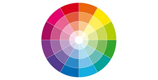
2. How do the colours work together? Do you choose complimentary colours on opposing sides of the colour wheel to create a sense of excitement? Or do you choose analogous colours to reinforce a particular mood?
3. How do the colours work against your entrenched competitors’ colours? This is especially pertinent for challenger brands: Easyjet’s orange and white was a dramatic alternative to British Airway’s red, white and blue.
4. Are the colours memorable? British researchers have found that Easyjet and Cadbury’s are recognisable to the majority of consumers by their pantone alone.
5. Do the colours need to be tweaked over time? The McDonalds example is a dramatic one, but it isn’t unusual for brands to makeover the logos with a subtle change of hue to move with fashions over time.
6. Do the colours travel well? Do they hold different meanings for consumers in other significant markets?
7. Do they work for both print and online? Can you specify the colour in CMYK or pantone for print and replicate that exactly in RGB or hexadecimal? You need to ensure consistent branding across media.
A Rainbow of Fruit Flavours
To summarise: colour matters. But not as much as context.
Nevertheless: colours can make (or help to make) a powerful statement. Use them wisely.


